Virtual science labs: UX revamp
sharing the process that went into the redesign of Labster’s user-facing Web application
In this case study, we’ll be sharing the process that went into the redesign of Labster’s user-facing Web application, which provides access to Virtual Science Laboratories to students all over the world.
Haven’t heard of Labster ever!
Let’s start with an introduction to the product.
In the past years, many students were prevented from physically attending school & university science labs, not to mention that in normal times having such an infrastructure is costly & requires certifications.
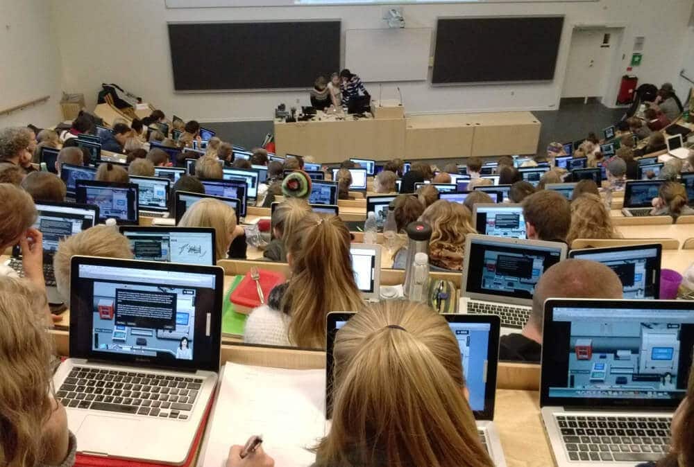
Labster provides virtual science labs in an immersive 3D experience via a Browser. Students can learn and interact with fully virtual science labs from anywhere in the world on their computers.
Teachers can see their student's quiz’s and grade performance, using Labster as an enhancement to their educational toolbox
Imagine the possibilities: a student can shrink to the size of atoms, reposition them, shrink back, mix different acids and observe their reaction, do an experiment in space, etc…
The labs are being used by California State University, Harvard, Gwinnett Technical College, MIT, and more.
Check out our co-founder’s TED Talk for more information.
Problem Statement
Our current web app to access the virtual science labs is limited in features and is not efficiently scalable (technically) against the growing number of teachers & students using our labs.

We need to ensure that we have a product that is useful, easy to use, and desirable.
Our Process
- User Research
- Understanding the problem(s)
- Visual design, Prototyping, and Testing
- Creating a Design System
- Iterations & going forward
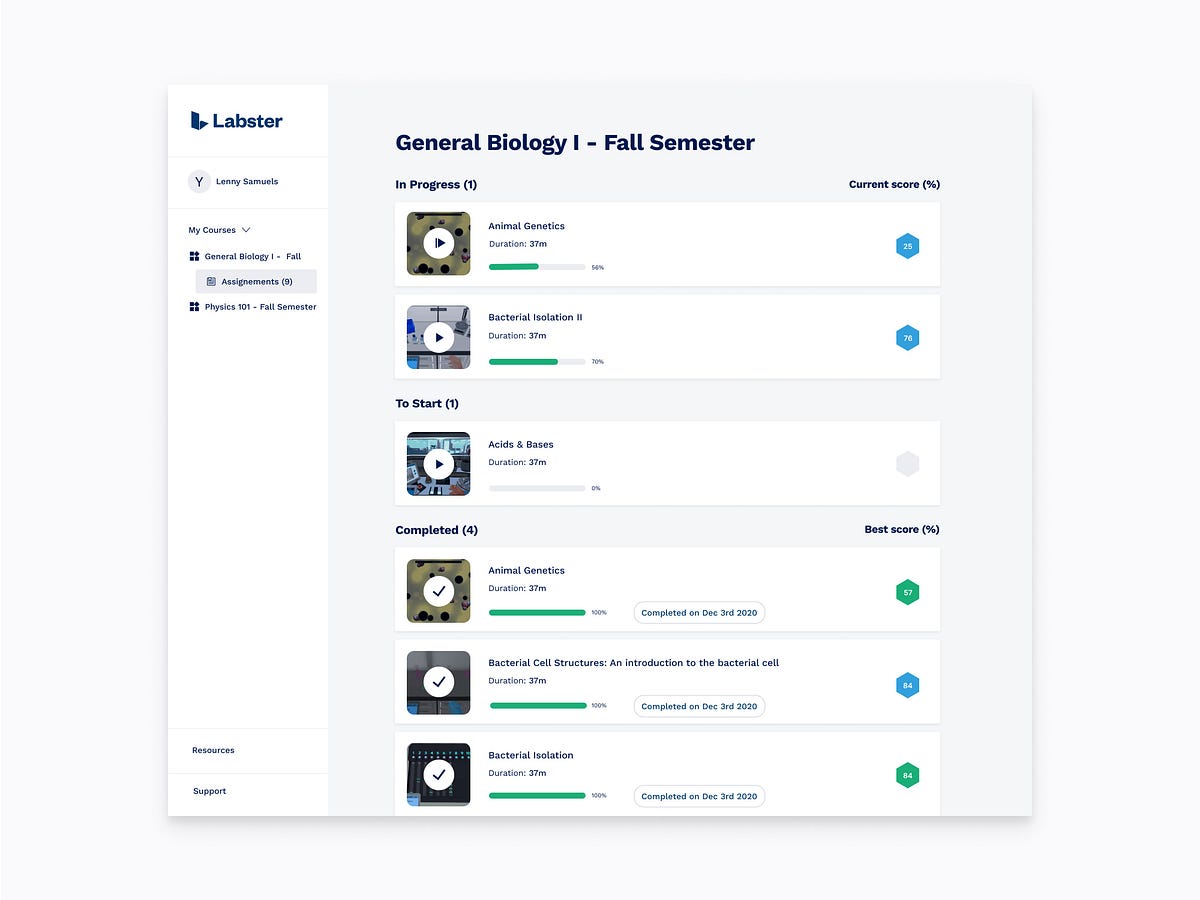
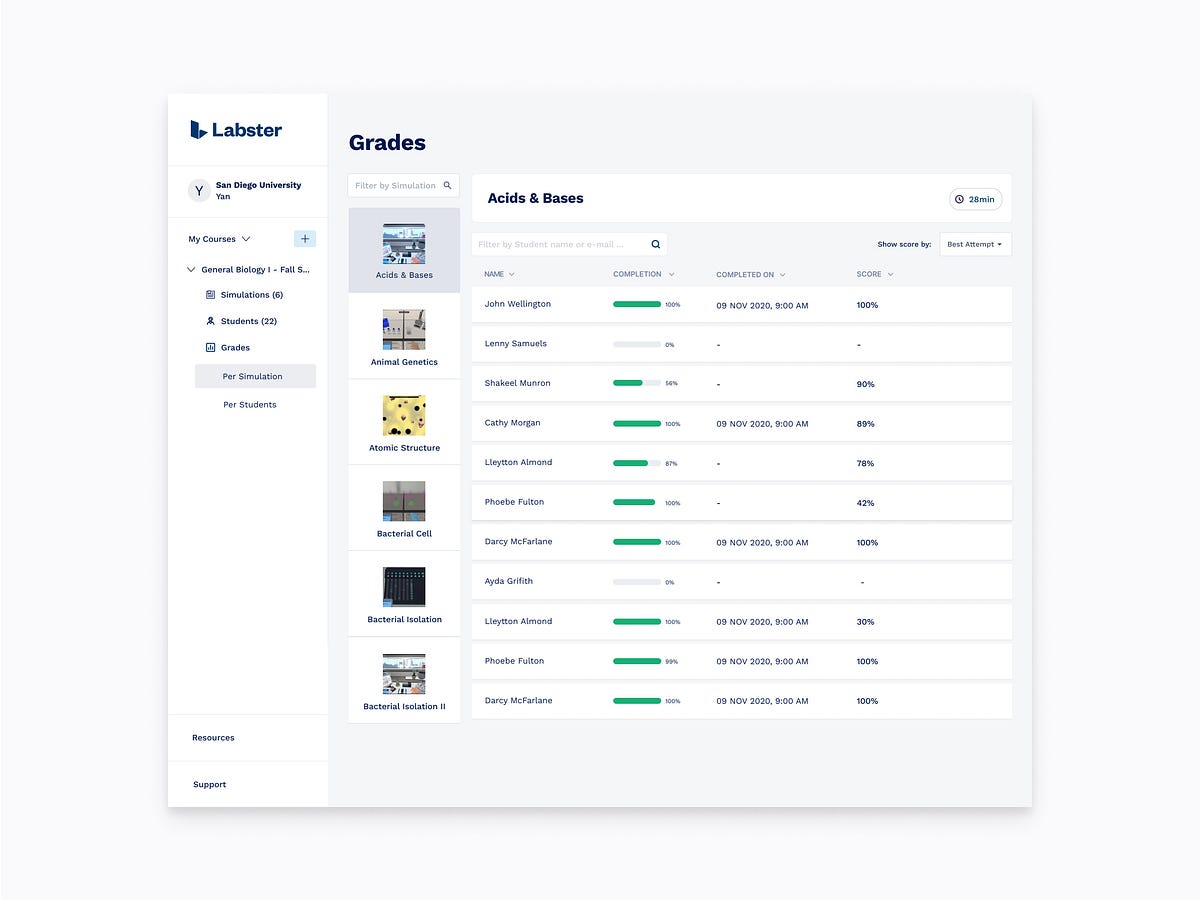
What can a Teacher do using Labster?
- Login / Logout
- Create a Course
- Add / Remove Science Labs
- Schedule Science Labs
- Play a Science Lab
- Invite Students
- See Students activities & grades
Sounds awesome. Doesn’t it?
Let’s dive in
Setting Goals
As Labster is growing and implementing a new market strategy, we need to make sure our products are top-notch and our users are happy.
Different departments have different issues, visions, and needs. To say a few: our customer success team has too many tickets, users are demanding new features, etc…
In the end, it comes down to:
- Business goal: To scale & reduce churn rate.
- User goal: To improve the entire experience of using Labster.
User Research
In the UX Process, it is important to know who are our users and what their needs are.
We reached out to our current users, doing field research and conducting over 40 user interviews for about ~20 hours of video calls.
We found out the causes of frustrations and limitations of our current web application:
- Difficulties to share Science Labs with Students
- The need for more control over the Science Labs (scheduling, etc..)
- Difficulties in deep-diving into grades
- etc…
and wrote all these issues & needs on cards.
Personas
Creating User cards will help us to step out of ourselves. It helps us to recognize that different people have different needs and expectations.
We identified our user groups and we aligned company-wide on the below fictional Personas (based on the above research):
- The Tech-savvy teacher
- The Traditional Professor
- The Super Busy educator
- The Careless one
- The Super teacher
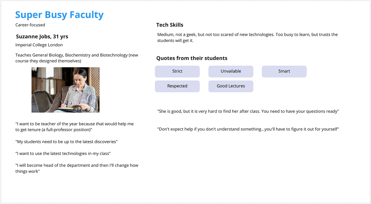

Thanks to personas, we’ll be able to work more mindfully by keeping the real user at the heart of everything we do.
Creating an opportunity tree
- We know the struggles of our users on the current platform.
- We know which features our users would like to have (opportunities).
Creating an opportunity tree helps to overcome many of the common pitfalls that occur during the product discovery phase by explicitly mapping out the opportunities and generating multiple ideas on how to achieve them.
After a few workshops, we identified all the opportunities we want to cover:

This opportunity tree is used as a guide and reference when validating future work.
Solution
For technical reasons, we decided to re-create a new web application from scratch using the latest tech stack. This means a whole new user-flows & user screens!
New Problem Statement
How can we enable our future customers to be empowered to learn & educate in a seamless way which celebrates online learning?
Creating a Design System
Before starting to prototype our new web application, we have to acknowledge our current UI gaps to improve them.
Labster is a multi-project company. There’s the website, the web application, the science labs, the mobile application…
Based on our UX research, we understood that visual inconsistencies were causing an increase in the cognitive load of our users.
Take these two dialogs between the Website and the web app as an example:


Creating a Design System will provide all the necessary information for developers to create consistent views and avoid these situations.
Below is a small portion of what we came up with, using Figma.
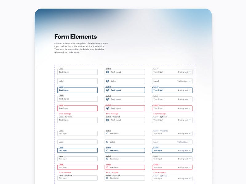
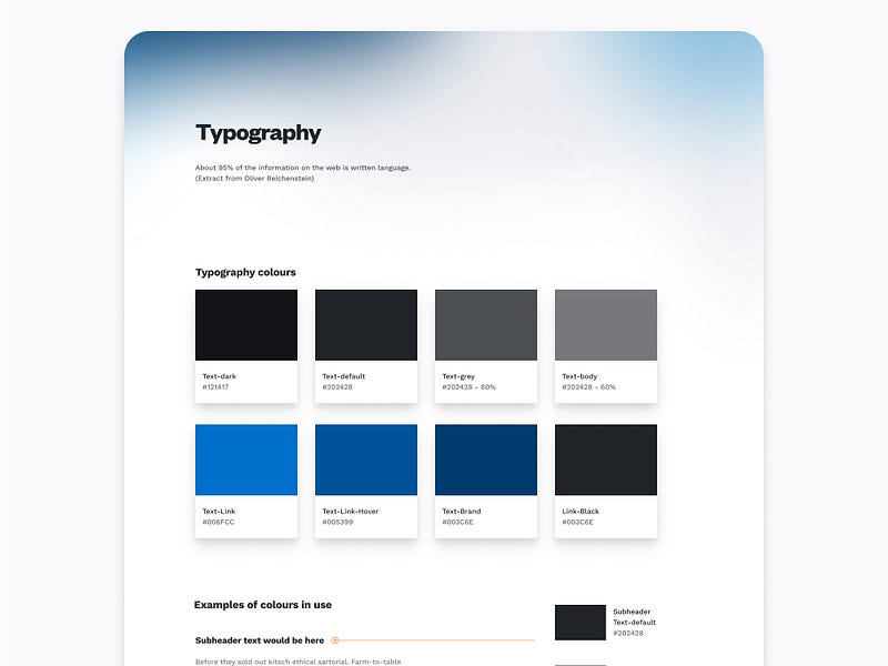
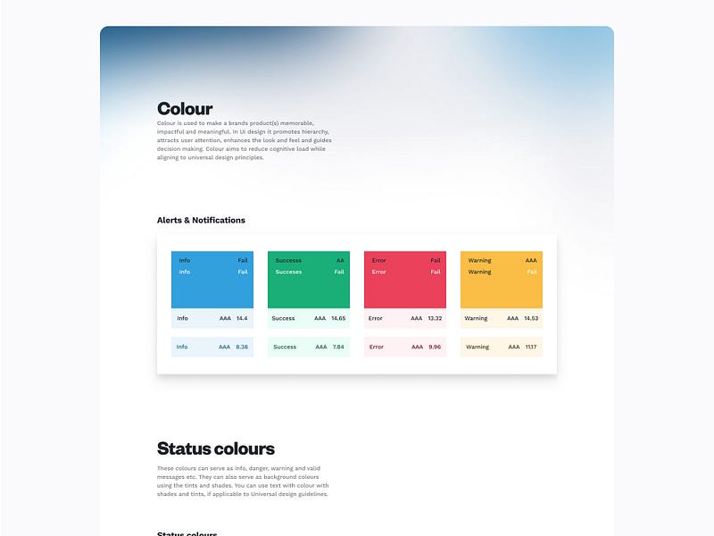
Then, using the Atomic Design principles, we created atoms, molecules, organisms, templates & pages.

Now that we have strong UI guidelines, the next step will be much easier.
Prototyping
It is now time to create our first usable designs so that the developer team finally understands what all of the above was about!
We’ll fast-track through this process here to keep our readers interested.
After a few days, we were able to come up with clean, consistent prototypes.


Delivering these designs to our developers is now a piece of cake.
User-centric thinking
Everything we produce is biased in some way. That’s why we like to ideate and test everything to validate our assumptions.
We chose to do Usability Testing: an observational methodology to uncover problems and opportunities within a design.
In short, there are three main elements within Usability Testing.
- A facilitator to guide the participant(s)
- Tasks the participants will complete
- 5–9+ participants willing to complete the pre-prepared tasks.
We’ve been using UserZoom to help with this process.
Validating or Rejecting Assumptions
We were surprised to hear from users that some of the assumptions we’ve made were incorrect.
For example, a big section of the new application was to allow users to create Courses and Sub-Courses. We had an assumption based on previous experience that teachers really need Sub-Courses. We conducted usability testing to define that:
- Users can use what we prototyped
- Sub-classes are actually an interest
What we found out is that teachers do not want sub-classes, and we scrapped that idea.
Going Forward in UX processes
UI/UX is a constantly evolving ecosystem and we have to keep monitoring our user sessions for frustrations, dead-clicks, and churn rates.
We are using several metric tools to continuously gather analytical data so that the UX team can gather quality feedback to the product owner for future updates.
Fullstory, for example, tells us about frustrating sessions, dead clicks, etc…

As our product is growing, so are the requirements. We’ve set clear UI guidelines for designing, researching, testing & prototyping, and our team is confident that we can deliver the highest quality of the product.
The below work was done & validated in a few days. It was developed just as fast thanks to re-using the same components in code, based on the design system.


Conclusion
When redesigning an application from scratch, it is important to set up a strong foundation (duh) by following known frameworks such as Design Thinking.
- Set up precise responsibilities for all the design processes and clearly define who gives the last approval.
- Don’t include too many people in the re-design to avoid spending 80% of your time convincing all the stakeholders. Work in a small, fast-moving team of experts.
- Iterate. Research. Test. Don’t expect to get it right the first time.
- Define which metrics to gather and evaluate, in order to assess if your new design is successful.
- Think about accessibility, internationalization, screen sizes & scalability.
That’s it for this story, thank you for following it through!